Easter Eggs
Not the ones left by a bunny, but those special hidden features in movies, on dvd menus, on websites, etc. While many of the products and tools created by the NRCC are readily available, sometimes they can be a little hard to find. We’d like to showcase a few of our “Easter eggs.”
First up is CLIMOD (http://climod2.nrcc.cornell.edu/), our public database. While it’s easy enough to find a link to the site on our homepage, once you’re in CLIMOD, there are a lot of products and options. A (single-station) product called Seasonal Ranking allows users to compare data for a specified period back through a site’s period of record. For example, you can compare February 2017’s average temperature at Central Park, NY to every other February back to 1876 and see how it ranks. The results are displayed via a graph and a sortable table.
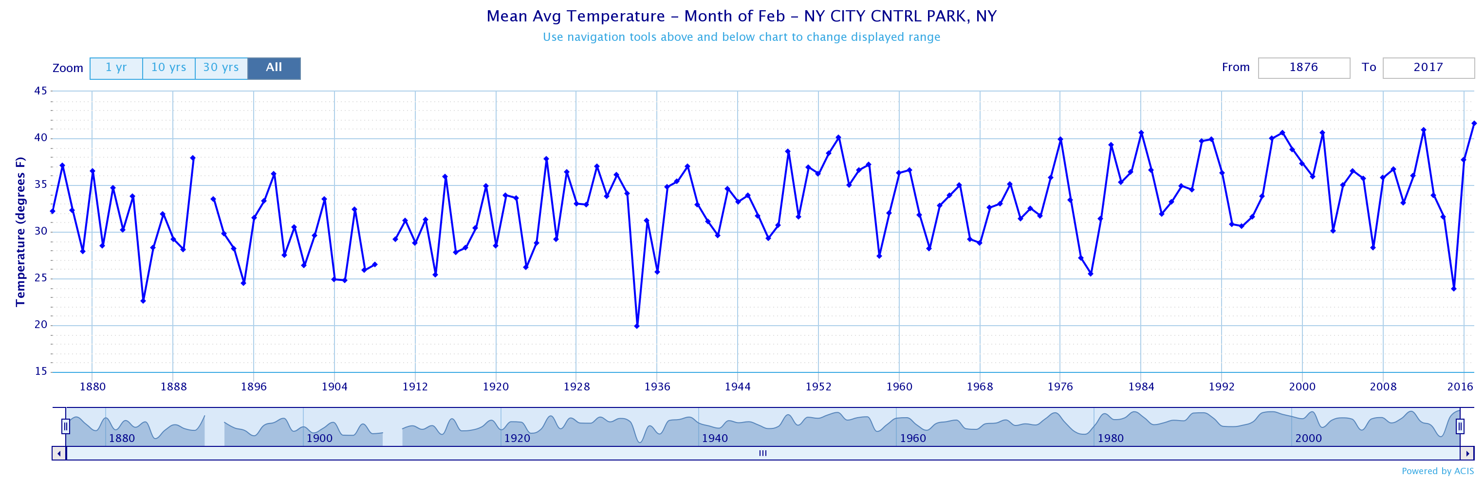
The Seasonal Ranking chart shows February average temperature at Central Park, NY through the site’s period of record. Click to enlarge.
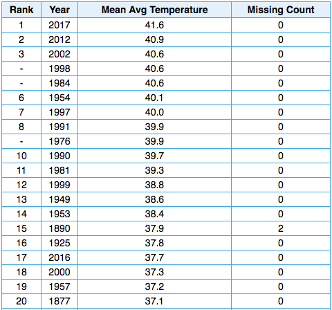
By clicking on the column heading to sort the table (in CLIMOD), we see that February 2017 was the warmest February on record at Central Park.
Another (single-station) product called the accumulation graph allows users to graph the accumulated value of a variable for a specified period of time. The graph also shows the highest and lowest years, as well as normal. For example, below is an accumulation graph of summer precipitation in Boston, MA.
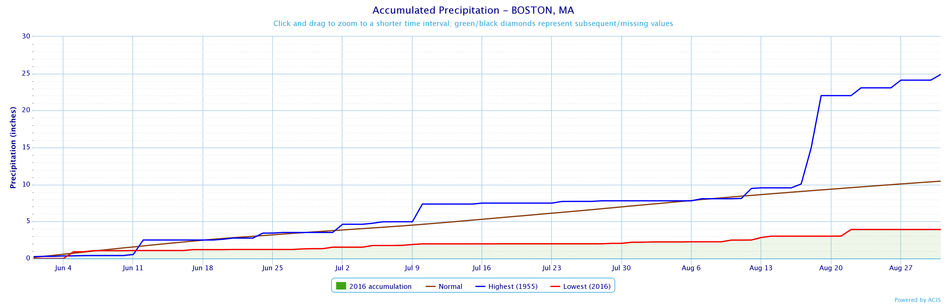
The accumulation graph shows summer precipitation at Boston, MA (green shaded area) was well below normal (brown line) and the lowest on record (red line), while 1955 was the wettest (blue line). Click to enlarge.
The NRCC’s extreme precipitation site (http://precip.eas.cornell.edu/) has several products for New York and New England. The Extreme Precipitation Table shows the return period based on precipitation amount. For example, when Islip, NY received 13.51 inches of rain on August 13, 2014, it qualified as a 1-day 500-year storm event. That means, on average, precipitation of that magnitude is only expected to occur once in a 500-year period. If you wanted to know the precipitation amount that would qualify as a 1-day 500-year storm event for the entire state, that’s possible, too, using the state and regional maps.
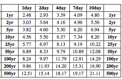
The extreme precipitation table for Islip, NY shows return periods for different precipitation amounts.
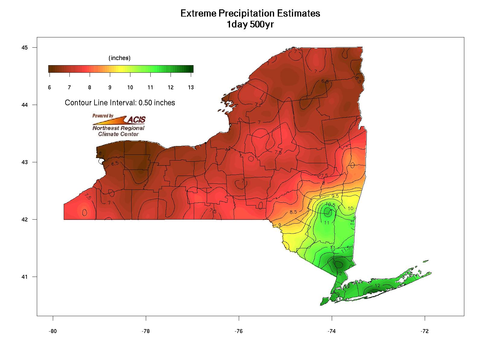
Precipitation amounts that qualify as 1-day 500-year storm events range from less than 6.5 inches in parts of western New York and the Adirondacks to more than 12.5 inches in parts of the lower Hudson Valley and Long Island. Click to enlarge.
Most folks probably know we’ve been doing a weekly drought update since last summer, but we have other drought resources, too. Based on the Palmer Drought Severity Index, the Percent of Area in Drought graphic (http://www.nrcc.cornell.edu/regional/drought/drought.html) allows you to see how much of the Northeast was in drought back though 1895. For instance, only 3% of the Northeast was in extreme drought in September 2016, but in July 1965, 56% of the region was.
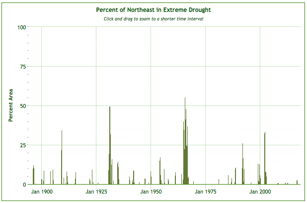
This graph shows how much of the Northeast (percent area) was in an extreme drought.
Our data power numerous products for different industries. For instance, the Climate Smart Farming Water Deficit Calculator (http://climatesmartfarming.org/tools/csf-water-deficit-calculator/) is driven by NRCC data. The tool estimates current and future soil moisture to help farmers and decision makers determine how often and how long to water crops in order to avoid plant stress. For the turf grass industry (and applicable to other industries), we offer maps of modeled two-inch soil temperature, accumulated Growing Degree Days, and weekly conditions and forecasts of evapotranspiration and moisture deficit (http://www.nrcc.cornell.edu/industry/grass/). Another example of our data in use is the (experimental) mosquito abundance projection tool, which was created for mosquito control and public health officials. This product estimates daily population of immature and adult mosquitoes relative to historical values via a regional map or a station-based graph (http://www.nrcc.cornell.edu/industry/mosquito/index.html).
Don’t see a product you need or just have questions about our products? Contact us at nrcc@cornell.edu or 607-255-1751.
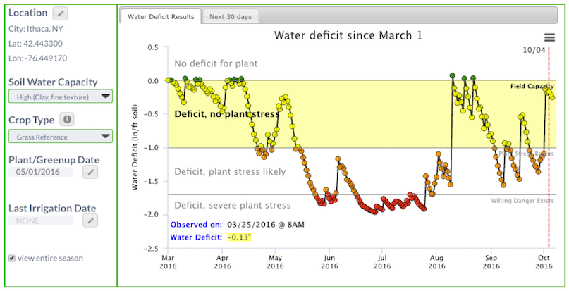
The Climate Smart Farming Water Deficit Calculator shows large soil moisture deficits and likely severe plant stress conditions during summer 2016 in Ithaca, NY. Click to enlarge.
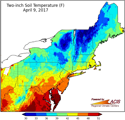
Modeled two-inch soil temperature for the Northeast.
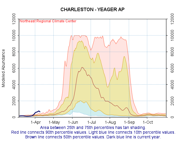
Modeled immature mosquito abundance at Charlestown, WV.